
Branding5 min read
Branding for Small Business: Where to Start and What Matters
What branding really means for a small business, and a simple plan to build a brand customers remember and trust.
We use necessary cookies to make the site work. With your permission, we'd also like to use analytics cookies to see how people use the site, and advertising cookies to measure our ads. You can change your mind at any time. Cookie policy
A brand identity is the set of visual and verbal elements that make your business recognisable. This guide explains each element, from logo and colours to typography, imagery and voice, and how to make them work together everywhere.
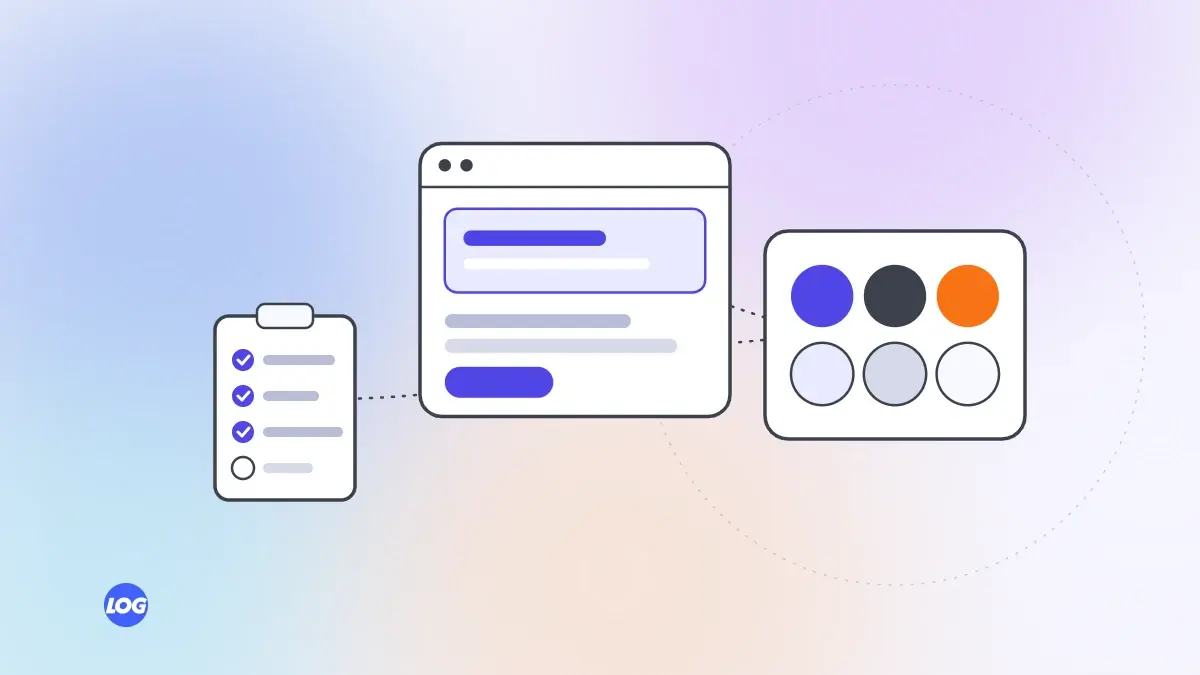
When people see your post, your shop sign or your invoice, they should recognise your business before they read the name. That recognition comes from a brand identity: a consistent system of visual and verbal elements. Here are the elements most businesses need and how to make them work together.
Your logo is the most recognisable mark of your business. A good logo:
Choose a small set of colours:
Record exact colour codes for screens and print, so colours look the same everywhere.
Pick one or two typefaces: one for headings and one for body text, or one family with different weights. Check that they are readable on phones, support the languages you use and are licensed for your needs.
Decide what your photos look like: real people and work, natural light, close-ups of craftsmanship, clean product shots. Real photos of your team, premises and projects build more trust than stock images. Define what to avoid as well.
Simple icons, patterns or shapes can make your materials recognisable. Keep them consistent in style, such as line thickness and corner shapes.
Your identity includes how you sound: your tagline, key messages and tone of voice. Describe your voice in a few words, with examples of what to say and what not to say.
Templates turn the identity into everyday use:
They save time and keep everyone consistent.
If you make videos or Reels, your identity can extend to them: an opening or closing frame with your logo, consistent caption styles and, if you use music, a recognisable style. Keep these simple, so they do not slow down or distract from the content.
Shop signs, vehicles, uniforms, packaging and printed materials are often where local customers meet your brand first. Check how colours print on different materials, how the logo looks from a distance and how it works in one colour for embroidery or engraving.
Most people will see your brand on a phone. Test every element at small sizes: the logo as a profile picture, colours on a phone screen and text readability. Then check print versions.
Choose colour combinations with good contrast, readable type sizes and do not rely on colour alone to convey meaning. An accessible identity reaches more people.
Collect everything in brand guidelines: logo files and rules, colours, fonts, imagery, voice and templates. Share them with your team, printers, developers and any agency digital marketing partners you work with.
Our branding service creates complete identities designed for screens first, with templates your team can use.
When we design a brand identity, we test the logo at profile-picture size before anything else, then build a colour palette with contrast rules, choose typefaces that read well on phones and define a photo style based on the client's real work.
We hand over logo files in every format needed, colour codes for screen and print, social and document templates, and short guidelines. Everything is checked on a phone screen as well as in print.
Usually a logo with variations, a colour palette, typography, a photography and imagery style, icons or graphic elements, a tone of voice, templates and guidelines that explain how to use them.
A brand is what people think and feel about your business. A brand identity is the set of visual and verbal elements you control, such as logo, colours and voice, that shape that perception.
Usually one or two main colours plus a few supporting colours for backgrounds and text. A small, well-defined palette is easier to use consistently.
Yes. A full version, a compact version and an icon cover most needs, from website headers to profile pictures and favicons. One-colour versions help on photos and print.
Templates make it easy for anyone in your team to create posts, documents and presentations that look consistent, saving time and protecting your brand.
Branding5 min read
What branding really means for a small business, and a simple plan to build a brand customers remember and trust.
Branding4 min read
How to define the way your business speaks, write simple rules and examples and keep everyone sounding consistent.
Branding4 min read
When a rebrand makes sense, the difference between a refresh and a full rebrand, and how to roll it out without losing customers.